I’m sure many of you who have lived on or currently live on a military base have been faced with the dilemma of wanting to decorate your cookie-cutter house.
Military life can be difficult, especially when your spouse is gone for long periods of time. This is perhaps the time when it is most important for many of us to feel comfortable in our temporary home. Knowing that you will be leaving your temporary home in a few years can be a pretty big deterrent when considering how much time and money you are willing to put into decorating it. You want to turn it into a unique space you and your family love that reflects your personal style while also being mindful of your budget.
Base housing is typically quite blah and uninviting with its faded brown wall-to-wall carpet, white walls and fluorescent lighting. This can be overwhelming and intimidating.
In this article I’ll show you a few design projects I have done in base housing that are great examples of how a room can be updated without breaking the bank and purchasing all new furniture and decor.
1. Living Room Facelift
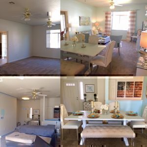
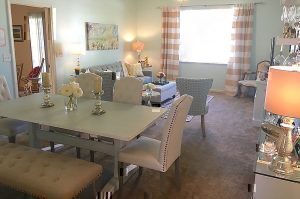
First up, an oddly shaped living room. This space was not conducive at all for a single cohesive seating arrangement and an inconveniently placed door leading into the kitchen created an awkward divide in the middle of the room. Rather than create two separate seating areas, it was divided into a living room and dining area.
Once the layout was set, wall color selection was next. A lot of people are hesitant to paint the walls in base housing, but I highly recommend it. Even if you are only in your house for a year, it makes a world of difference and the daily happiness you will get from that pop of color is well worth having to paint it back when you move. To brighten the room the walls were painted a light aqua. Gold accents placed throughout add warmth and complement gold flecks in the window treatments and an abstract painting found at one of my favorite budget-friendly home goods stores.
The dining table, once brown and weathered was refinished to a soft cream color. The badly scratched top was concealed with a light teal, stick-on wallpaper; it is easily removed and can survive everything from hot plates to chocolate milk and wine spills. Light-colored furniture was placed throughout and an upholstered bench replaced two dining chairs on one side of the table to further unify the space.
For those of you with pets and children, you don’t have to avoid light-colored furniture for fear of stains; there are some new fabric protector sprays on the market that are virtually fool-proof.
2. Dining Area to Sitting Room Conversion
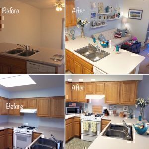
Next up, a dining area that became a second sitting room. Initially, this space off the kitchen was set up as the dining room, which is quite common in on-base housing. After seeing how people congregated in the kitchen and how the large dining table was taking up dead space, the area was transformed into a sitting room that is much more conducive to social activity in the kitchen.
To break up the two spaces, a light grey statement wall is the backdrop for the seating arrangement. To compensate for the lack of shelving in the home, a 3-D gallery wall was installed using floating shelves that display photographs and decor accessories; framed photographs were hung as well. A refurbished antique sea chest used as a coffee table echoes the rustic vibe of the sea grass counter stools.
If you have dark furniture, this living room update is a great example of how you can brighten your space without having to purchase all new pieces. I have found that light blue is one of the best accent colors to use when working with dark furniture. The walls were painted a sky blue and a blue tufted ottoman replaced an oversized, bulky coffee table.
Yellow and white striped linen curtains frame the window and warm up the room. A fun twist on wall décor are the two white shutters that flank the curtains; these were a steal from a local craft store. A mason jar holding a faux hydrangea was hung from each, attached by a simple hook and nautical rope. Floating shelves frame the TV and break up the large wall.
To update the entryway, a refinished dresser was converted into an entryway console chest. The top drawer was replaced with three wicker baskets and Italian-blown glass knobs replaced the old iron hardware. A wreath hangs from the top of the mirror, a unique way to add greenery to a room.
3. Miscellaneous Spaces
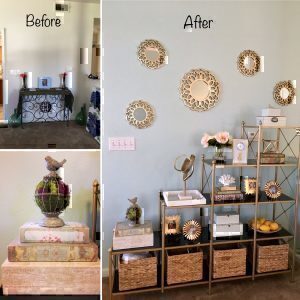
Most base homes have at least one or two rooms with an awkward corner that ends up just being dead space — too small for a seating arrangement, too big for a potted plant. I love utilizing shelving units in these spaces to display items my clients love to look at every day, whether it be books, photographs or keepsakes. This nook was updated with a shelving unit decorated solely with décor accessories from budget friendly stores, vintage books and wicker baskets from a local hardware store.
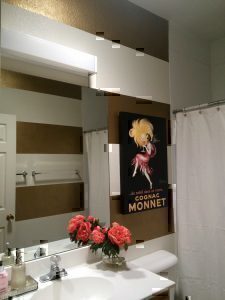
Perhaps my favorite painting technique is stripes. Sometimes doing a solid color in a small space can create the illusion of the walls closing in on you. Stripes are a great way to change it up and are relatively easy to do. To brighten up this small bathroom that lacked natural light, gold metallic stripes were painted. A cream color shower curtain with subtle gold threading was selected so as not to compete with the walls. The faux coral peonies pick up on the coral color in the Cognac Monnet canvas.
It is amazing what a little paint, creativity and budget items can do to transform a sterile base house into a bright, cheery and comfortable space and that goes a long way when dealing with the stresses that accompany military life.
[maxbutton id=”13″]


